
10 ways to speed up web image loading
According to the HTTP Archive, images make up almost half of the weight of an average website, with around a megabyte per page. That is a megabyte that every user must download to see your website, which can often take a while for people on slow connections. Luckily, there are ways to mitigate this without much difficulty, from using modern image formats like AVIF or WebP, to using CDNs optimized for images, to replacing raster icons with SVGs. Here are 10 ways to improve image loading on a site.
If you want to learn more about how to optimize your website, be sure to check out: - 10 ways to speed up font loading - 10 ways to speed up JavaScript loading
How to make images load faster
1. Serve correctly sized images
Images do not need to be the same size for all devices. An image might look blurry on one display, like a 4k computer screen, but could still look very sharp on a smaller display, like a phone. It is a waste to serve higher definition images meant for those larger, higher resolution displays, to smaller displays. Luckily, the web provides mechanisms by default to help you serve different images based on screen resolution: the srcset attribute.
srcset allow you to pass multiple different sources that are only activated if a particular condition is true, like if the screen width is over 1024 pixels. You can also describe a pixel density rather than a fixed width. To implement srcset, all you have to do is this:
<img
	src="/images/default.webp"
	sizes="(max-width: 720px) 600px, 1200px"
	srcset="/images/small.png 600w, /images/default.png 1200w"
/>
Let’s go through this step by step. First, we define the default image URL, which can be used for browsers that do not support the sizes and srcset attribute. Next we define the image sizes using the sizes attribute. Here, we can pass a media query to select the 600px wide image only if the screen is below 720 pixels wide. Otherwise, browsers will use the second declaration, a 1200px image. However, the browser still does not know which URL to select.
In order to send the browser to the right image URL based on the width in sizes, we use srcset. In the above example, when the size from sizes is 600 pixels, we tell the browser to request /images/small.png, and if the image width is 1200px, the browser requests images.default.png. While this example only has two images, you can add as many as you want for any valid media query.
Browsers might not always choose images based on just screen width. Network connections and other factors can affect the browser’s choice.
2. Serve images with modern formats
When you think of the format an image is in, you probably think of PNGs or JPEGs. These are the most common images formats, so that is for good reason. Unfortunately, they use somewhat dated compression methods, and many modern image formats can help you compress your images better without sacrificing quality. The two most notable of these are WebP and AVIF.
WebP, a format developed by Google in 2010 based on the VP8, offers superior compression compared to most other image formats while having 96%+ browser support. AVIF is another image format, developed by the Alliance for Open Media as a derivative of AV1, that offers compression even better than WebP. Unfortunately, AV1 is currently unsupported in older browsers and Microsoft Edge due to “licensing” issues.
Here is an example of an AV1 image versus its JPG equivalent (note this will not work on Edge due to the above issue):
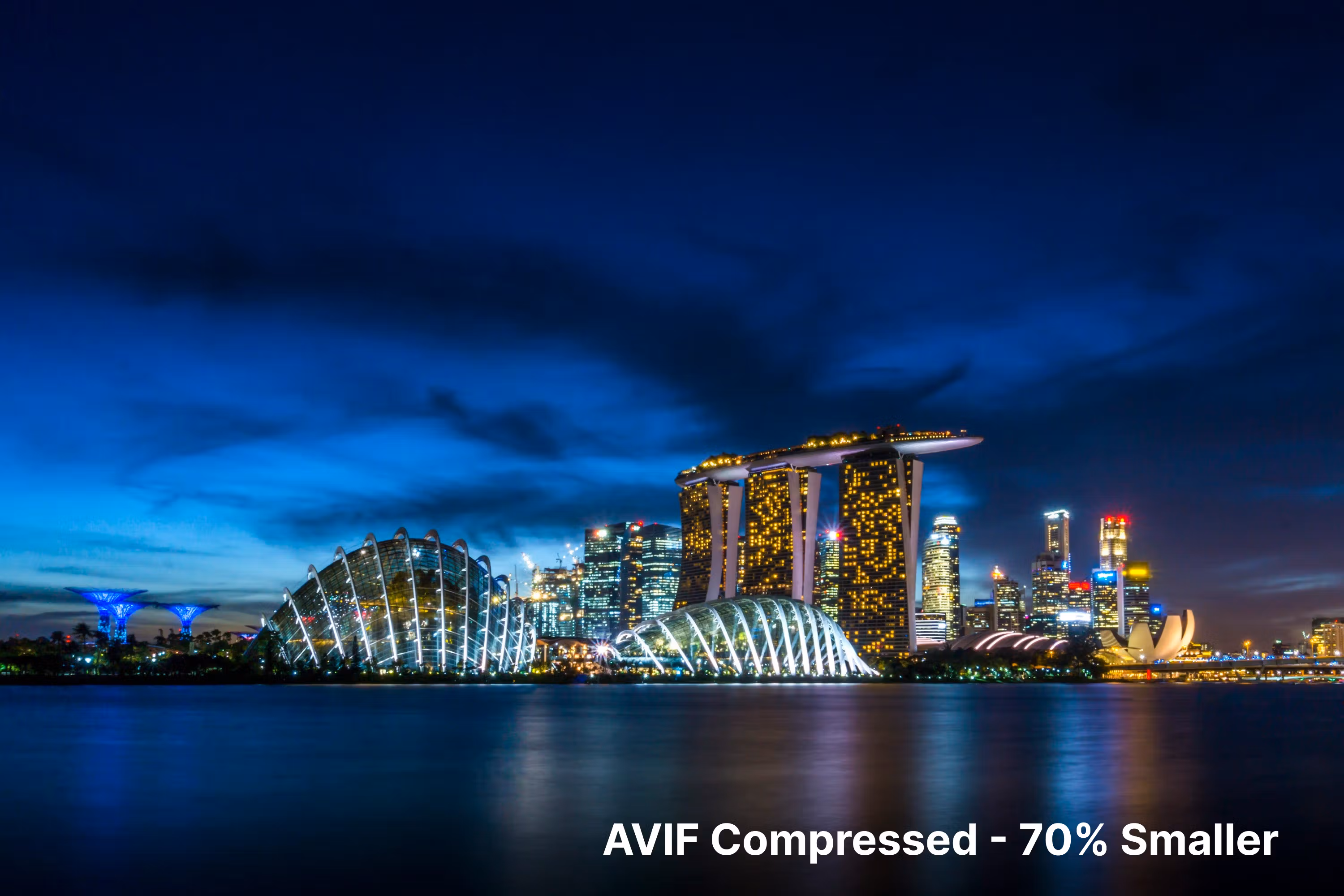
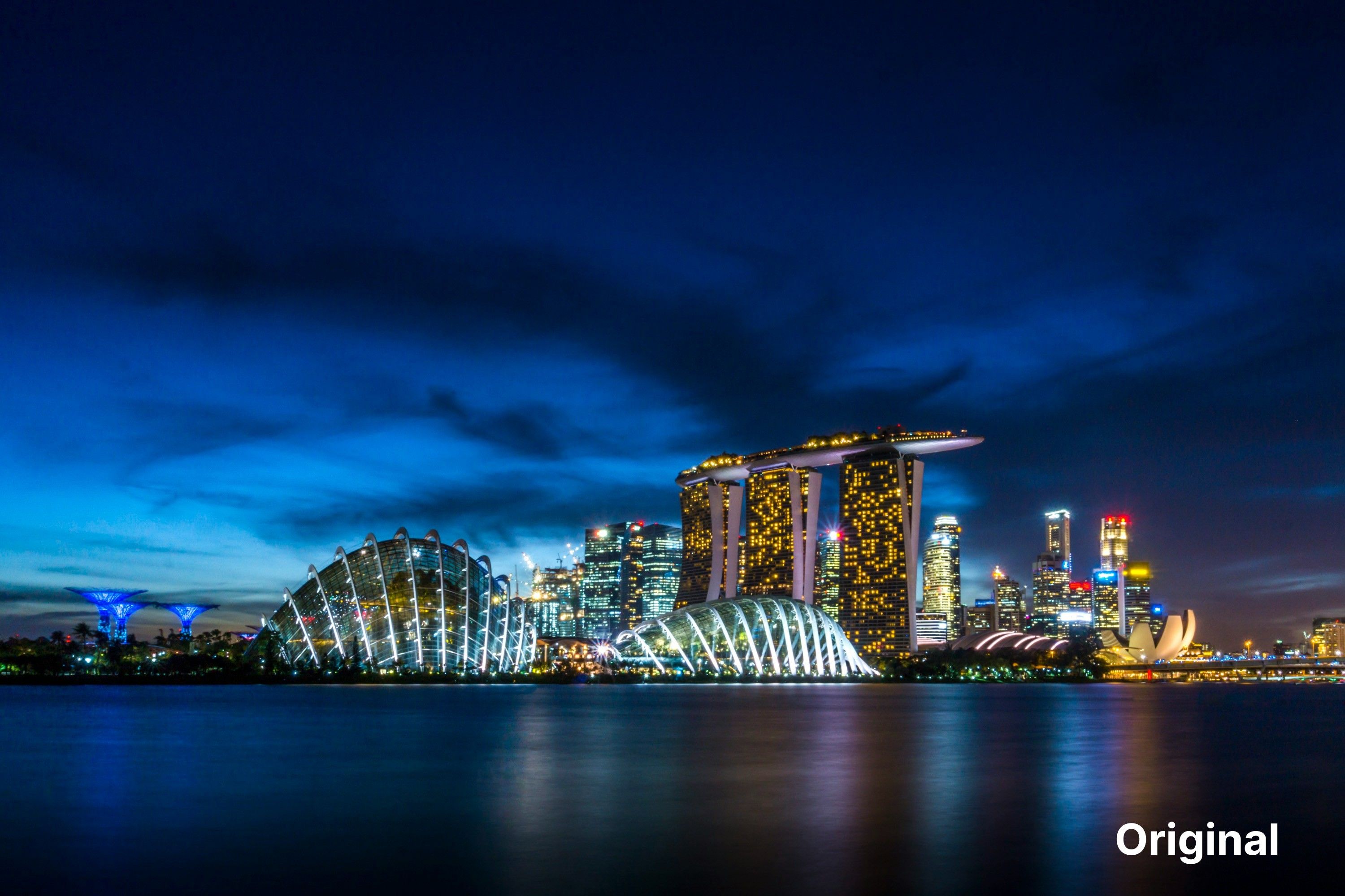
Photo by Mike Enerio on Unsplash
The AVIF image is 50-70% smaller. Note that the size difference can vary but should be in that area. There is almost no quality difference between them, and in certain cases, the AVIF image seems to have removed some noise present in the JPG.
It is also pretty simple to use new formats. You can use an app like Squoosh to easily convert images to different formats. From there, you can use the new images like how you would use other images.
However, you might want to offer the most modern image format to newer browsers while supporting older formats for browsers that don’t support newer formats. Luckily, this isn’t too hard to implement using the <picture> element. <picture> works similarly to srcset and sizes, but it is a separate HTML element, and supports format fallbacks as well as media queries. You can implement <picture>s like this:
<picture>
	<source srcset="/images/avif-optimized.avif" type="image/avif" />
	<!-- First choice for browser --->
	<source srcset="/images/webp-optimized.webp" type="image/webp" />
	<!-- Used by browser if first choice is not supported --->
	<img src="/images/fallback.jpg" alt="photo" width="1200" height="600" />
	<!-- Used by browser if both previous choices are not supported; other attributes, like `alt` and `sizes`, will be shared across all possible images --->
</picture>
You can also use srcset as you would with individual <img> elements, except that sizes must be specified on the final img element rather than a source.
3. Use an image-optimized CDN
In the previous two tips, we have shown how to optimize images manually. Manually optimization works well in many cases, but sometimes, you don’t want to deal with all of that. You might also want to be able to provide a wider variety of optimizations without having to store countless image variants. There are image optimized CDNs available that will perform a lot of these transformations automatically. For example, ByteofDev (this blog) uses ImageKit, which, given device information given in the image request, will provide an image optimized to use the best format that device supports, with the size optimized for the device’s screen size. All of this is done on the server, meaning you only need one <img> element with one source.
Of course, there are some disadvantages to image-optimized CDNs. They can cost quite a bit, especially compared to a standard CDN’s incredibly low costs. They also introduce more complexity because they usually act as a proxy between whatever storage solution you use and the user. Of course, that isn’t unlike how other CDNs work. Perhaps I have been spoiled by hosting services that integrate CDNs into the host :). However, certain services offer integrated storage.
Here is a list of image-optimized CDNs that you might want to check out:
- ImageKit - Less advanced optimizations; includes extra features like integrated storage
- Cloudflare Images - Great for if you are already using Cloudflare; includes integrated storage; optimized for storing user generated content
- Cloudinary - Likely the most popular image-optimized CDN; very large feature set; can get expensive
- Fastly - Good for existing Fastly users; Slightly smaller feature set than some competitors;
4. Lazy load images
Many images on your website might not be seen by the user upon page load, but by default, all images load immediately. The “eager” nature of these images causes users to download resources that might be halfway down the page. The solution to this is to use lazy loading. By default, HTML images load eagerly, meaning they are requested immediately as the page loads, no matter where on the page they are. Luckily, by adding the loading="lazy" attribute, you can make it so the browser only loads images when the user scrolls near them.
<img src="/images/lazy.webp" loading="lazy" />
<!-- Lazy loaded! -->
Lazy loading is supported by 87% of users, including all modern browsers. You can also implement lazy loading through JavaScript, but at this point, it isn’t really worth the complexity and performance cost.
Do not lazy load images you expect to be in the user’s initial viewport because this will delay their loading unnecessarily.
5. Decode images asynchronously
In a similar vein to image lazy loading, you can also enable asynchronous image decoding. In Chrome and Safari, images are decoded synchronously by default. Synchronous decoding allows for all content to be displayed simultaneously but comes at the cost of speed, as the user needs to wait for the image to be decoded before content can be displayed. To solve this, you can use decoding="asynchronous" which will not make the browser wait for the image to decode.
<img src="/images/lazy.webp" loading="lazy" decoding="asynchronous" />
<!-- Lazy loaded and asynchronously decoded! -->
Just like lazy loading, you should use asynchronous decoding with care. Test the results before implementing this widely, as it can cause flashes of unstyled content (FOUC).
6. Provide low resolution placeholders
In certain cases, it can be helpful to provide blurry/low resolution placeholders for images. Placeholders reduce perceived loading time by showing a blurry version of the image before the image finishes loading. You can implement this using tools like BlurHash, which turns an image into a short Base83 binary string that can be decoded into a blurry placeholder before the full image loads. Many image CDNs support this as well. If none of these make sense and you are willing to sacrifice some looks, you can use a low-resolution placeholder.
Unfortunately, all of these options require at least some JavaScript to switch out images when the full-resolution version loads. The only way to implement placeholders without JavaScript is to use a little-known feature of JPEGs called progressive loading, where, rather than loading the image top-down, pixels in the image are distributed in such a way as to start with a low-definition version of the whole picture. Unfortunately, this means you cannot use other image formats like AVIF or WebP, as those do not support progressive loading. In the future, JPEG-XL, a new JPEG replacement with compression comparable to AVIF, might allow you to implement this without using JPEG. JPEG-XL is not supported in any browsers other than Safari at the moment, but that might change in the future.
7. Cache Images
Caching is one of the best ways to improve performance for any asset. If the server indicates caching is allowed, browsers will store assets locally, meaning the user doesn’t have to request them again when they next visit the site. Caching comes with the risk of an update to an image not being shown to the user, as their cached version does not have this update. However, you can mitigate this by changing the filename of the asset when the content changes, similar to what bundlers do. To use caching, you need to add an HTTP Cache-Control header to your HTTP responses, which can be done in varying ways depending on what you are using as a CDN. The cache control header should look something like this:
Cache-Control: max-age=86400
In the above example, browsers will cache the result for one day (86,400 seconds). If you know your content will not change without the filename/path changing, you can make this a lot longer.
As previously mentioned, implementing this is very dependent on your hosting provider/server implementation/CDN. I recommend looking up documentation on how to set HTTP headers. Many CDNs, like Cloudflare, also provide specific settings for cache control.
8. Define image dimensions
While defining image dimensions doesn’t necessarily speed up image loading itself, it can improve the user experience while the image is loading by reducing Layout Shift. If you do not define dimensions, the browser will not know the size of the image until it loads, and when it does load, it will shift all content below the image down, making content harder to read. If you define the image dimensions, the browser will reserve space for that image before it loads, preventing layout shift. There are two ways to allow the browser to reserve space: explicit attributes and CSS.
The simplest way to allow the browser to reserve is to explicitly define width and height on the <img> element.
<img src="/images/default.webp" alt="photo" width="1200" height="600" />
That is the best option if you know the exact dimensions and don’t expect them to change based on screen size or other factors. However, sometimes, you might need a little more flexibility. You can get this flexibility from CSS aspect-ratio. `aspect-ratio allows you to define an aspect ratio, which combined with one dimension, can help the browser accurately reserve space for the image.
<img src="images/default.webp" alt="photo" />
<style>
	img {
		width: 100vw;
		aspect-ratio: 16 / 9;
	}
</style>
The above CSS tells the browser to make the image fill the screen’s width and for the height to be 9/16 of whatever the width is. You can change the aspect ratio if the image isn’t 16:9, and even use height as the basis for the width instead.
9. Layout images lazily with content-visibility
By default, images are rendered in the layout upon page load. If you have a lot of images, this can use up a lot of unnecessary compute and slow down overall rendering. Luckily, modern browsers provide a property can control rendering: content-visibility. Setting content-visibility to auto tells the browser to only render the image when the user scrolls near it, rather than rendering everything upon page load.
<img src="images/default.webp" />
<style>
	img {
		content-visibility: auto;
	}
</style>
Once again, apply
content-visilitywith care. Avoid using it for images viewable in the initial viewport.
10. Use SVGs when possible
This is perhaps the most significant tip I have, as SVGs are incredibly underrated. Many raster images can be replaced with SVGs, leading to significantly smaller file sizes and sharper images.
SVG (scalable vector graphic) is unlike the other image formats we discussed previously. Where most image formats are raster (also commonly referred to as bitmap), meaning they define what are essentially grids of pixels, SVG is a vector graphics format, meaning it defines images in terms of shapes and lines. SVGs tend to scale from complexity, not resolution. This makes an image scalable to any resolution, as computers can render the figures at a very high definition without the image defining each pixel. SVGs are also more readable because they use XML rather than a binary format. In fact, many designers right SVGs directly in text.
SVGs are most popular for small images like icons, but you can use them in pretty much any image that has simple objects that were created digitally. You should never vectorize photos, as even though there are automatic vectorizers, photos have noise and complex lighting that are unsuitable for being vectorized. The other exception is images that are very complex or use other images that are only available rasterized. Other than that, SVGs can work quite well. For example, many of the heading photos in this blog are SVGs, allowing me to deliver sharp images with <10kb payloads.
Implementing SVGs in a website is very similar to implementing raster images. To create an SVG file, use a design program like Inkscape or Adobe Illustrator and export as an SVG. Make sure everything you use within your image is an SVG, or else you will lose the benefits of an SVG. Once you do this, you can use the SVG in an <img> tag.
<img src="/images/default.svg" />
You can also embed the SVG directly into HTML, meaning you don’t need to send another request for the SVG.
<svg>
	<!-- SVG here -->
</svg>
However, embed with care, as it makes the SVG harder to cache and means the SVG blocks page loading. Inlining SVGs, just like any other assets, should only be done for small SVGs.
Conclusion
Thanks for reading! If you have any tips you think I should add, don’t hesitate to get in touch with me (I should eventually have a comment section set up :)). I hope this helps you speed up your website images; if you want to speed up other areas of your website, like fonts or JavaScript, check out these articles: